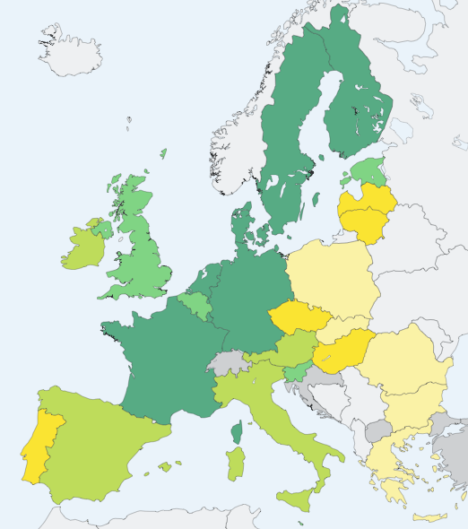
I wouldn’t have expected the EU to have anything as sexy as a map-based visualisation tool but Eurostat‘s is not bad at all and lets me generate all kinds of infographics (like the one below) for teaching use.

Percentages of households with broadband in Europe 2009

what do the various colors mean?
Comment by Russell Brake — 20 February 2010 @ 10:23 pm
Darker = more broadband. I can’t remember what the exact percentages are offhand but poke around the Eurostat site http://epp.eurostat.ec.europa.eu/portal/page/portal/information_society/data/main_tables and you can find lots of internet-related stats.
Comment by David Brake — 21 February 2010 @ 12:14 pm