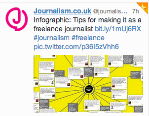
I saw this and was momentarily intrigued. Then I clicked on the pic to see it full size. It didn’t get any bigger and was therefore still unreadable. So I ended up having to go visit the original story at Journalism.co.uk – now the individual text was readable but you couldn’t get a sense of the meaning of the whole without going full-screen to this from Mattermap. And then? All it turns out to be is a grouped collection of tweets, which were all available and more easily readable in the text of the website below anyway. I got there in the end but three clicks, some head-scratching and a scroll later. Sometimes good old-fashioned text is all you need!
13 May 2014
No Comments »
No comments yet.
RSS feed for comments on this post. TrackBack URL
